
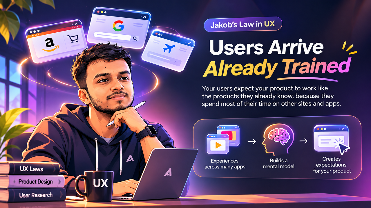
Why your users arrive at your product already trained, and what that means for your design.
Jakob's law in UX rests on a simple piece of arithmetic. Your users spend nearly all of their online time on sites and apps that are not yours. Every one of those visits quietly teaches them where the search box sits, what the cart icon means, and how a checkout ought to behave. By the time they reach your product, they arrive carrying a full set of expectations, and none of it was formed on your screens.
The law was stated in one line by Jakob Nielsen, the Danish usability pioneer who co-founded the Nielsen Norman Group, in his year-2000 article "End of Web Design": users spend most of their time on other sites. A 2017 Nielsen Norman Group video later gave it the name designers use today: Jakob's Law of the Internet User Experience. The phrasing is about websites, but the mechanism applies anywhere users move between many products: mobile apps, desktop software, and now AI tools.
Understanding the law is easy. Applying it well is the actual skill, because familiarity is a tool, not a cage. This article covers where the expectation comes from, what it looks like in real interfaces, where designers misread it, and how to use it deliberately.
In short: Jakob's Law says users expect your product to work like the products they already know. Because they spend most of their time elsewhere, their habits were formed elsewhere. The practical payoff: follow established conventions for the routine parts of your interface, and spend your originality where it actually differentiates you.
Where the Expectation Comes From
Nielsen describes three drivers behind the law, and together they explain why the expectation is so hard to fight.
First, the web offers a teeming multitude of individual services, and users flit between them, allocating only a small percentage of their time to any particular website. In Nielsen's own image, your site is a grain of sand in a large universe. You are not the main character in your user's digital life; you are a brief stop.
Second, each user's mental model of how things work is constructed from the totality of what they encounter across many years. Slight variations get ignored; commonalities engrave themselves. The model builds slowly, through reinforcement from the patterns they meet most often. Nobody sat your user down and taught them that the logo goes top-left; a thousand sites taught them without a single lesson.
Third, users apply that model as an expectation to every new site they meet. Comply and the site feels easy; violate it and they will use it wrong and get into trouble. That is the whole mechanism: a prediction about what happens when habit meets novelty.
Notice what this implies. You do not teach your users how the web works; the rest of the web already did. Your product is graded against an exam written by thousands of other designers, but the exam has a study guide: the familiar design patterns everyone already follows.
Familiar Patterns in the Wild
Conventions are easiest to see once you start looking for them. Here are the ones doing the heaviest quiet work across the web and mobile apps.
Logo top-left, linking home. It is so standard that breaking it is measurable: a study Nielsen cites found 4% of users failed to reach the homepage in one click with left-aligned logos, versus 24% with centred ones, a six-fold increase. Nothing else changed; the convention had been doing invisible work all along.
Search as an open text box at the top of the page, usually to the right. Nielsen's advice is blunt: offer search unless the site is tiny, and put it where millions of other sites put it. Users should never hunt for the thing that helps them hunt.
The shopping cart icon, top-right in commerce. Amazon pioneered this vocabulary in 1994, and three decades later your customers still know exactly where to click to review what they are about to buy.
Form controls descended from physical objects. Toggles, radio inputs, and buttons originated as tactile controls, which is why their digital versions feel instantly understandable. The metaphor did the teaching decades ago; the interface just inherits it.
Standard scrolling and pinch-to-zoom on mobile. Traditional scrolling is empowering: the user moves the content, the content moves, and the user feels in control. Overriding that contract is one of the fastest ways to make people feel helpless.
Loud, vivid primary buttons. It can feel like a high-pressure tactic, but since almost every site marks its primary call to action this way, users have come to expect it. Make your "Book now" button subtle, and users may overlook it simply because it does not look like a primary action.
Travel-booking patterns you already know by heart. Bottom tab bars with Home, Search, Bookings, and Profile. A calendar date picker with a visible selected range. Steppers for passenger counts. A price summary before payment. Users complete these flows on competitor apps in minutes, on their first visit, because the pattern did the onboarding for you.
The YouTube Redesign: Changing a Pattern Without Punishing Users
Conventions do change, and the skilled move is managing the change rather than denying it. When YouTube launched its major 2017 redesign after years of the same look, the team did not simply flip the switch: desktop users could preview the new design, submit feedback, and revert to the old version if they preferred.
The clash between the old mental model and the new one was avoided by letting users switch when ready. That is the template: announce the change, keep the familiar version available for a limited time, and hand the timing to the user. You are not asking permission to improve; you are refusing to charge loyal users a surprise tax.
Three Things Jakob's Law Does Not Mean
The law is short, so it gets stretched. Three corrections keep it honest.
It is not a ban on originality. Nielsen is explicit: genuinely better innovations become the new standard over time, and when they do, you should adopt them. The hamburger menu, pull-to-refresh, and pinch-to-zoom were all novelties once. The rule is about timing and cost: do not make users pay the learning cost before a pattern has earned its place, break convention only where the payoff clearly outweighs the relearning, and ease the transition the way YouTube did.
It does not say users prefer the familiar in every sense. "Prefer" is a loaded word. A familiar pattern is understood faster, which is not the same as being enjoyed more or remembered better. If you are designing something meant to be memorable, a brand site, a campaign page, a portfolio, a measured dose of novelty is a legitimate choice. The law warns against confusing users; it does not prohibit standing out. Put the novelty where it carries meaning and keep the machinery conventional.
It is not only about websites. Nielsen notes the law extends to any situation where users encounter many designs without living inside one. Mobile apps are the obvious case, and the same logic now applies to AI chat interfaces, voice assistants, and augmented reality. In new interaction styles the standards have not settled yet, so watch what most competing designs converge on and adopt those patterns as fast as they emerge. New tech is wild tech; the familiar parts are your anchors.
Remember: your users do not learn your product from scratch. They judge it against every product they have ever used. Match the patterns they already trust, and they spend their attention on their task instead of your interface.
Five Practical Ways to Apply Jakob's Law in UX
1. Audit your product against the conventions of its category. List the ten most common interactions in your product, then check how the three most popular competitors handle each one. Where you deviate, you owe the deviation a reason. "It looks better" is not a reason; "it completes the task faster, and we tested it" is.
2. Use established patterns for commodity interactions. Search, sign-in, carts, filters, pagination, form validation: these are solved problems. Solving them again is not innovation; it is homework your users have to redo.
3. Spend your novelty budget where you differentiate. Every product gets a small allowance of unfamiliarity. Spend it on the one or two things that make you different, not on navigation, buttons, and terminology. If everything is novel, nothing feels special; it just feels like work.
4. When you must change a pattern, manage the transition. Announce it, keep the old way available for a while, and let users switch when ready. As the Laws of UX guidance puts it: minimise discord by empowering users to continue using a familiar version for a limited time.
5. Test the break, not the keep. If you follow convention, testing confirms the ordinary. If you break it, test with real users and watch for hesitation at the exact point of the break. A break that survives a usability test has earned its place; a break defended only by opinion has not.
Familiar or Novel? A Working Table
| Interaction | Convention users expect | Keep it familiar | A break can pay off when |
|---|---|---|---|
| Site logo | Top-left, links to home | Content sites, always | Rarely; only if reaching home is not a core action |
| Search | Open text box at the top, usually right | Content and commerce sites | The product has almost nothing worth searching |
| Primary action | Visually dominant button, consistent position | Forms, checkouts, bookings | Practically never; hiding the main action for style always costs you |
| Navigation | Top nav on desktop, bottom tabs on mobile | Nearly all consumer apps | A task-based model is genuinely clearer, and users confirm it in testing |
| Scrolling | Native scroll; content moves with the gesture | Everywhere | Almost never; overriding scroll reliably causes disorientation |
| Form controls | Native-looking inputs with clear labels | Forms of any kind | You have a complete custom system that preserves every affordance |
Frequently Asked Questions
Does Jakob's Law mean all products should look the same?
No. It means the routine parts should behave the same. Differentiation belongs in what your product does and says, not in reinventing the back button. Two travel apps can share every convention and still feel completely different through content, tone, pricing clarity, and service.
What if every competitor follows a bad convention?
A bad convention that everyone follows is still familiar, so breaking it still charges a learning cost. Break it only if the improvement is large enough to cover that cost and you can carry users across the change. Small improvements are not worth big relearning; save the break for a genuinely better model.
How does this connect to the other UX laws?
They reinforce each other. Familiar patterns reduce what a user must figure out, which is Hick's Law working in your favour: fewer decisions at the moment of action. My breakdown of Hick's Law in UX covers that side in detail. Miller's Law explains why grouping familiar items into chunks sticks in memory, and Fitts's Law explains why conventional placement plus generous targets converts familiarity into speed.
Key Takeaways
- ✓ Users spend most of their time on other sites, so they expect yours to work the same way.
- ✓ User mental models are built from years of other products; you inherit them for free or fight them at a cost.
- ✓ Keep commodity interactions conventional and spend your novelty budget on what makes you different.
- ✓ When a pattern must change, ease the transition: preview it, collect feedback, and keep the familiar version temporarily.
- ✓ Test every break with real users; a break that survives testing has earned its place.
Conclusion
Jakob's Law is, at bottom, a law about respect. Your users' time and attention were invested long before they met you, in thousands of other products. Honouring the conventions they already know is not a lack of creativity; it is the decision to spend your creativity where it can be felt. Follow the conventions for the routine, test the breaks that matter, and let familiarity carry the weight it was built to carry.
References and Further Reading

Written by
Md Arshak Hossain Zahid
UI/UX Designer · Founder of ArshakUIX
Practical insights on UX laws, usability, design systems, and product design.