
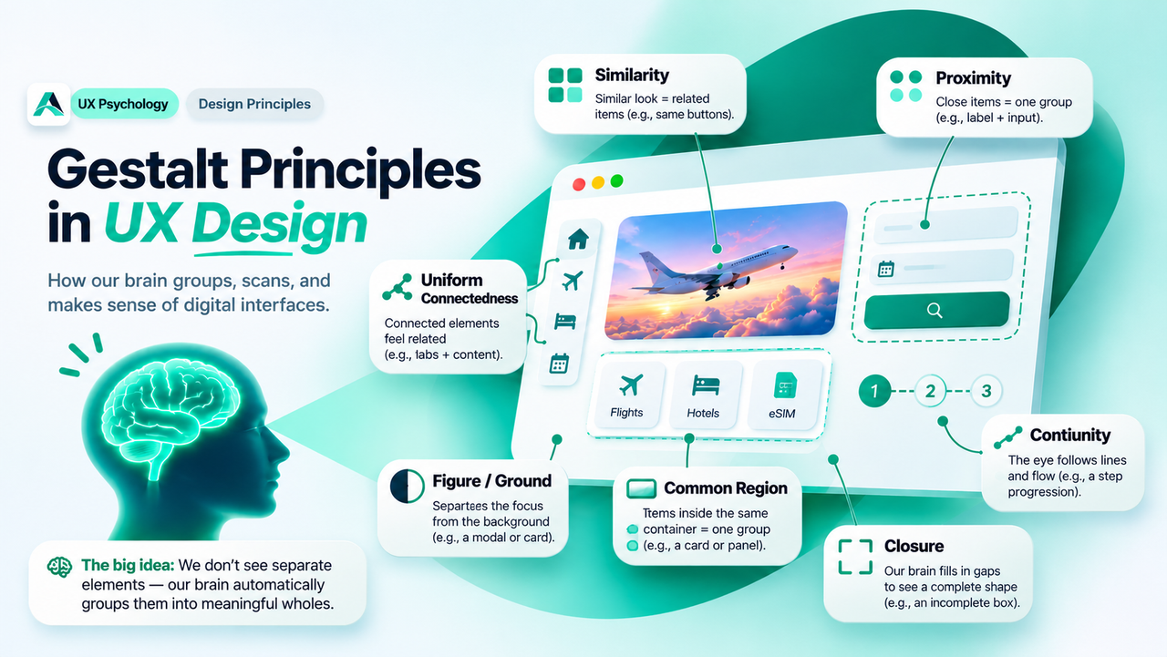
Your users never read a screen element by element. They group, scan, and decide in seconds. These century-old psychology principles explain the instinct behind that behaviour, and show you how to design layouts that read themselves.
In short: Gestalt principles describe how people automatically group what they see: elements that sit close together, look alike, or share a boundary are read as one unit. Design with these instincts in mind, and users will scan your layouts in seconds instead of puzzling over them.
Why Your Brain Groups Everything
Around a century ago, in 1920s Germany, a group of psychologists led by Max Wertheimer, Kurt Koffka, and Wolfgang Köhler began asking a deceptively simple question: when we look at the world, why do we see organised wholes instead of scattered fragments?
Their answer became Gestalt psychology. "Gestalt" means unified whole, and its central claim is that the mind actively organises what the eyes deliver. We see a flock of birds, not a hundred separate birds. We see a face, not two eyes plus a nose plus a mouth. As Koffka put it, the whole is other than the sum of its parts.
This organising instinct, called Prägnanz, is the mind's preference for the simplest, most orderly interpretation of what it sees. It evolved for survival: an ancestor who spent minutes analysing every leaf would not have survived the predator hiding among them. For interface designers, Prägnanz is a gift: your users' visual system already wants to find the groups, so you do not need labels, arrows, and borders everywhere to explain which elements belong together. Your job is to make sure it finds the right ones.
The Principles That Matter Most in UX
Researchers have named more than a dozen Gestalt principles. For screen design, seven do most of the work.
Proximity. Elements placed close together are perceived as a group, while elements placed further apart read as separate groups, which makes it the strongest grouping tool in interface design. A form label sits directly above its input because proximity tells the user they belong together. When a settings screen spaces every row evenly, users lose the plot. Group related settings tightly and add breathing room between groups, and the structure appears on its own.
Similarity. Elements that share visual traits, such as colour, size, shape, or type style, are perceived as related, even when they are not adjacent. All primary buttons share one style so users instantly know what a primary action looks like. All links share one colour and treatment for the same reason. Break similarity deliberately and you create emphasis: the one button that differs is the one that gets remembered and tapped.
Common region. Elements inside the same boundary are perceived as a group, sharing characteristics or functionality. Cards, panels, modals, and even the subtle background tint behind a search bar all work this way. Research summarised by Nielsen Norman Group notes that a clear boundary is such a strong cue that it can overpower competing cues like proximity or similarity. Put two unrelated items in the same card and users will assume they are connected, whether you meant it or not.
Figure/ground. The eye separates what it sees into the figure (the object of focus) and the ground (the background). Good interfaces make this separation effortless: dark text on a light background, a modal dialog over a dimmed page, a dropdown menu floating above the content beneath it. When the separation is weak, for example a popup with barely any dimming, users feel the discomfort immediately, even if they cannot name the cause.
Closure. We mentally fill in gaps to perceive complete shapes. This is why minimalist logos work: the eye completes the suggestion. In interface design, closure explains why simple geometric components feel calmer than ornate ones.
Continuity. The eye follows lines, curves, and aligned sequences, and treats elements arranged on a visual path as part of one whole. Timelines, step indicators in a checkout wizard, and horizontally scrolling carousels all ride on continuity. Break the path and you break the story: a step indicator whose dots do not align reads as random dots, not as a journey.
Uniform connectedness. Elements visually connected by a line, an arrow, or a shared edge are perceived as more related than unlinked ones. Tabs joined to their panels and nodes linked in a flow diagram both use this principle.
| Principle | What the eye does | A common UI example |
|---|---|---|
| Proximity | Groups what sits close together | Labels hugging their form fields |
| Similarity | Groups what looks alike | One button style for all primary actions |
| Common region | Groups what shares a boundary | Cards, modals, grouped search bars |
| Figure/ground | Separates focus from background | Dialogs over dimmed pages |
| Closure | Completes unfinished shapes | Simple geometric icons and logos |
| Continuity | Follows lines and sequences | Step indicators, timelines, carousels |
| Uniform connectedness | Groups what is linked | Tabs joined to their panels |
Gestalt in Real Products
Open any well-designed product and these principles are quietly at work.
Search results pages are a textbook case. The Laws of UX site points to Google's search results: the spacing inside each result is tight, while the space between results is generous. That rhythm alone tells you where one result ends and the next begins, before you have read a single word.
Banking apps lean on common region. Each account or card sits inside its own container, so balances, numbers, and actions inside one container are never confused with those of another. Travel apps do the same with flight options: one card per flight, fare details inside the card's boundary, and you intuitively know which price belongs to which flight.
Forms are where proximity earns its salary. The most common form mistake is the orphaned label: a label floating halfway between two inputs, so the user cannot tell which one it describes. Move the label close to its input and the ambiguity disappears. The meaning changed because the spacing changed.
Similarity also shapes how users compare options: when choices share one visual language, comparing them feels fair and fast, the same instinct behind keeping choices few and clear, which we covered in Hick's Law: Why Fewer Choices Help Users Decide Faster.
Remember: proximity is the strongest and cheapest grouping tool you own. Move related things closer together and unrelated things further apart, and you will fix half of all "this screen feels confusing" complaints without changing a single word or colour.
Common Mistakes
Even designers who know these principles by name keep tripping over the same habits.
Even spacing everywhere. When every gap on a screen is the same size, the eye finds no groups and the layout reads as one long list of strangers. Vary your spacing deliberately: tight inside groups, generous between them.
Borders on everything. Common region is strong, which is why overusing it backfires. If every element gets its own card, nothing feels grouped and the screen becomes a sea of boxes. Use boundaries for genuine units, and let spacing do the rest.
Inconsistent similarity. Primary buttons that change style from screen to screen teach users nothing. Each new style is a new group in their mind, and they must re-learn what it means every time. One function, one style, everywhere.
Weak figure/ground. A modal with a nearly invisible dim layer, or a tooltip that blends into the page, forces the user to do the separation work the design should have done. Make the background recede decisively.
Grouping by colour alone. Colour is a similarity cue, but roughly one in twelve men has some form of colour vision deficiency. Back colour groupings with spacing, shape, or labels so the groups survive in greyscale.
Applying Gestalt in Your Next Design
Turn the principles into a short working checklist you can run on any screen.
- Group with spacing first. Before adding a single border or background, try fixing the layout with proximity alone. If the groups read clearly, you are done. Borders are the backup, not the default.
- One style per function. Audit your buttons, links, and headings. Everything that does the same job should look the same; anything that looks the same should do the same job.
- Keep labels close to their controls. This is proximity at its most practical. Check every form, filter, and settings row for orphaned labels and pull them home.
- Separate figure from ground. Dialogs, menus, and tooltips need clear contrast against what sits behind them. Test this at a glance, from arm's length, in poor light.
- Simplify to the essential shape. Prägnanz rewards the simplest interpretation. Fewer decorative fragments, cleaner geometry, and calmer layouts ask less of the user's visual system and get scanned faster.
FAQs
Are Gestalt principles just about making things pretty?
No. They are about comprehension. Grouping determines whether users understand what belongs together, what to do first, and where to look next. Aesthetics is the pleasant side effect of getting the grouping right.
Which principle should I master first?
Proximity. It requires no new components, no colour decisions, and no developer effort beyond spacing tokens, yet it fixes more confusing screens than any other single change. Make it a habit: related things close, unrelated things apart.
Do the principles ever conflict with each other?
Yes, and knowing the pecking order helps. A strong boundary (common region) can overpower proximity and similarity, which is why an unrelated element trapped inside a card still feels connected to the card's contents. When cues disagree, decide which relationship matters most and let its cue win, then weaken the losers.
Key Takeaways
- ✓ Your users group every screen automatically. Design the groups they will find, not just the elements.
- ✓ Proximity is your cheapest, strongest tool: tight inside groups, generous between them.
- ✓ Similarity teaches what things are: one style per function, everywhere.
- ✓ Common region can overpower other cues, so only put genuinely related things inside one boundary.
- ✓ Figure/ground, closure, continuity, and connectedness handle focus, simplicity, flow, and linkage. Use all seven as a checklist, not as decoration.
Conclusion
Gestalt psychology is a century old, but it describes the newest interface as accurately as the oldest. Every tap, scroll, and scan begins with the eye asking one question: what belongs together? Designers who answer that question well build interfaces that feel obvious. The grouping was always going to happen. The only choice is whether you designed it or left it to chance.
References and Further Reading
- Gestalt Principles: Interaction Design Foundation
- 5 Principles of Visual Design in UX: Nielsen Norman Group
- Law of Proximity: Laws of UX

Written by
Md Arshak Hossain Zahid
UI/UX Designer · Founder of ArshakUIX
Practical insights on UX laws, usability, design systems, and product design.