
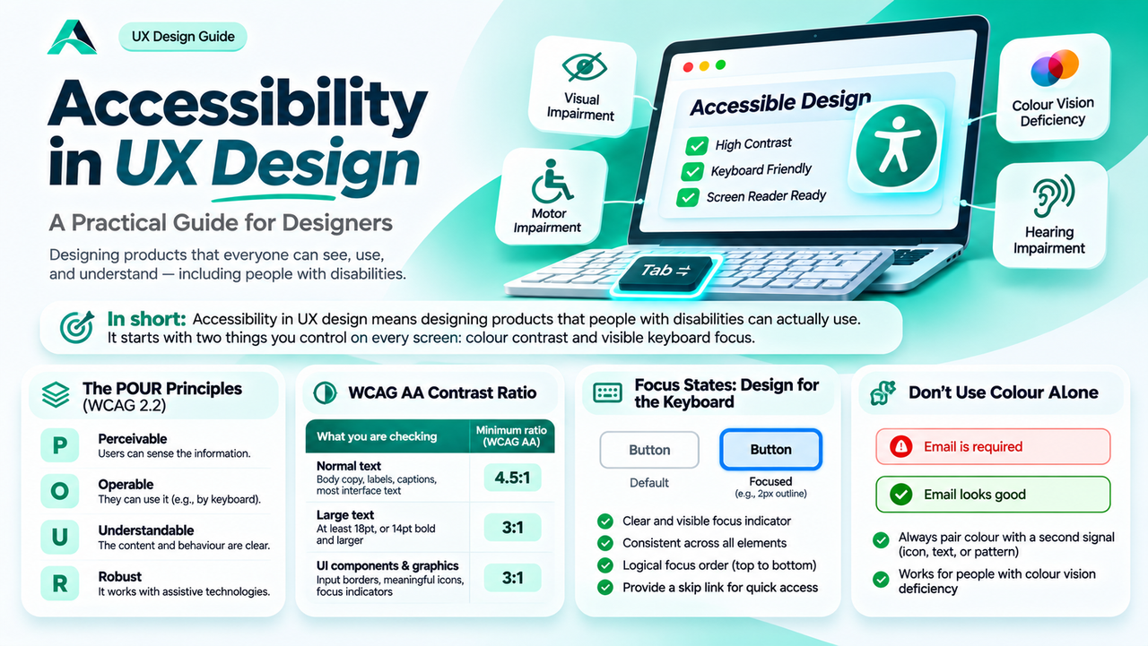
Some of your users cannot see the screen clearly, cannot use a mouse, or cannot tell two colours apart. This guide shows how contrast, focus states, and a few honest habits make your designs work for them, and for everyone else too.
In short: Accessibility in UX design means designing products that people with disabilities can actually use. It starts with two things you control on every screen: colour contrast and visible keyboard focus.
Why Accessibility Is a Design Skill, Not a Checklist
A screen looks beautiful in Figma, then a real person opens it on a phone in bright sunlight and cannot read a word. That moment is an accessibility problem, and a design problem too.
Most accessibility failures are design decisions: text too pale to read, a focus state nobody designed, an error shown in colour alone. The designer chooses the colours, the type sizes, the states, and the labels, and so decides whether the product works for everyone.
The scale is easy to underestimate: according to the CDC, 61 million adults in the United States live with a disability. Accessible design also helps everyone else: high contrast text is easier to read in sunlight, and a visible focus state helps power users who never touch the mouse.
What Accessibility in UX Design Really Means
Accessibility in UX design means people with disabilities can perceive, understand, navigate, and interact with a product, and complete the same tasks as everyone else. It is not about a page that can technically be opened, but about a product that can actually be used.
The shared standard is WCAG, the Web Content Accessibility Guidelines from the World Wide Web Consortium. WCAG 2.2 organises its guidance under four principles, remembered as POUR: Perceivable, Operable, Understandable, and Robust. Perceivable means users can sense the information. Operable means they can use the interface by keyboard alone. Understandable means the content and behaviour are clear. Robust means the product works with assistive technology.
WCAG sets three levels, A, AA, and AAA, and level AA is the practical target for most products. Aim for AA on every screen. Passing an automated checker does not prove a product is accessible. Only testing with real people does that.
Contrast: The WCAG Contrast Ratio Every Designer Should Know
Colour contrast is the ratio between the brightness of text and its background. The higher the ratio, the easier the text is to read. The WCAG contrast ratio for normal text is 4.5:1, and level AA sets three numbers to know.
| What you are checking | Minimum ratio (WCAG AA) | What it covers |
|---|---|---|
| Normal text | 4.5:1 | Body copy, labels, captions, and most interface text |
| Large text | 3:1 | Text at least 18pt, or 14pt bold and larger |
| UI components and graphics | 3:1 | Input borders, icons that carry meaning, focus indicators |
Level AAA raises the bar to 7:1 for normal text and 4.5:1 for large text.
The easiest way to check a pair is the WebAIM Contrast Checker, a free tool where you enter two hex values and get the ratio with a pass or fail verdict for each WCAG level. Check every text colour against every background it will sit on, including cards, banners, and dark mode variants.
In practice, contrast fails in predictable places. Secondary text is the most common: designers lighten it for hierarchy, and it drifts below 4.5:1. Placeholder text is another repeat offender. The best habit is to check contrast in the design token, not on the finished screen.
Focus States: Designing for the Keyboard
Not everyone uses a mouse. Some people cannot use one at all, and others prefer the keyboard because it is faster. They press Tab to move through a page, and the browser shows them where they are with a focus indicator, usually an outline around the current element. If that indicator is invisible, they are navigating blind.
The most common failure is also the most avoidable. Designers and developers remove the default outline because it looks untidy, and never design a replacement. The Nielsen Norman Group puts it plainly: links, form fields, buttons, and menu items should be focusable, with a clearly indicated focus state.
Good keyboard focus states are thick enough to notice, high in contrast against the element and its background, and consistent across every interactive element. A common choice is a 2px outline in a strong brand colour, with a small offset so it does not merge with the edge. Define it in your design system.
Focus order matters as much as visibility. Tab should follow the visual order, top to bottom and left to right. When a modal opens, focus should move inside it and stay there until it closes. A skip link at the top should let keyboard users jump straight to the main content.
The cheapest test is to unplug your mouse. Press Tab and try to complete the most important task using only the keyboard. If you lose track of where you are, you have found a real bug.
Colour Is Never the Only Signal
About one in twelve men and about one in two hundred women have some form of colour vision deficiency. When the only difference between an error and a success is colour, those users get no information at all.
Never communicate important information with colour alone. Pair it with a second signal, an icon, a text label, a pattern, or a change in shape. An error field should have a red border, an error icon, and a message that says what went wrong.
The greyscale test catches these problems in a minute. Turn your design greyscale and ask whether you can still tell which fields have errors and which button is primary. If not, add a second signal.
Alt Text and Labels: Small Words, Big Difference
A screen reader reads a page aloud, and your words decide what that person hears. Alternative text, or alt text, is the short description attached to an image. Good alt text is succinct and describes what the image adds. Decorative images should have empty alt text, so the screen reader skips them.
Form labels work the same way. A visible label tells every user what a field is for, and it is what a screen reader announces. Placeholder text is not a label: it disappears the moment someone starts typing. Keep the label visible above or beside the field, and use the placeholder only for an example of the expected format.
Error messages deserve the same care. A good error names the field, says what is wrong, and says how to fix it, for example "Enter a valid email address". Put the message next to the field, and move focus to the first error when a form is submitted.
A Practical Accessibility Check for Every Design
You do not need a specialist audit to catch most accessibility problems. A short check, run on every screen before handoff, will find the majority.
1. Check the contrast. Run every text colour against its background in the WebAIM Contrast Checker. Normal text must reach 4.5:1, large text 3:1, and meaningful icons and input borders 3:1.
2. Walk the keyboard. Unplug the mouse and Tab through the whole flow. Every interactive element should be reachable, the focus indicator always visible.
3. Turn it greyscale. Check that errors, selections, and primary actions are still clear without colour.
4. Zoom to 200 percent. Increase the browser zoom and check that text is not cut off and controls do not overlap.
5. Read it aloud in your head. Imagine the page read by a screen reader. Does every image have useful alt text? Does every field have a visible label? Do the links say where they go?
6. Test with real users. Include people with accessibility needs in your usability testing. Five participants are enough to find most problems.
Remember: if a person cannot read it or reach it with a keyboard, the design is unfinished, no matter how good it looks. Accessibility is not a layer you add at the end.
Common Mistakes
Treating accessibility as a QA task. By the time a screen reaches QA, the colours are chosen and the fixes are expensive. Fix it in the token and the component.
Hiding the label inside the field. Placeholder text as a label looks minimal and fails everyone who needs to check what they typed. Keep labels visible.
Designing focus states by deleting them. Removing the outline is not a design decision. Design a focus ring that fits your brand and apply it everywhere.
Checking contrast once, on one background. A colour that passes on white can fail on a card or a photo. Check every pairing it will appear on.
Writing alt text for decoration. Decorative images should have empty alt text, so screen readers skip them.
FAQs
Do I need to meet WCAG level AAA?
No, not for most products. Level AA is the standard target, and the level most laws reference. Aim for AA everywhere, and use AAA as a stretch goal for your most important text.
Does accessible design have to look plain?
No. Accessibility sets minimums for contrast, focus, and structure, and leaves the rest to your taste. These accessible design principles make design better, not plainer.
Where should I start if my product is already built?
Start with the pages people use most, and fix text contrast and keyboard focus first. Those two alone make the biggest difference for the most people.
Key Takeaways
- ✓ Accessibility in UX design means people with disabilities can complete real tasks, not just open the page.
- ✓ Normal text needs a contrast ratio of at least 4.5:1, large text at least 3:1, and UI components at least 3:1.
- ✓ Every interactive element needs a visible keyboard focus state, designed on purpose, never removed without a replacement.
- ✓ Colour is never the only signal. Pair it with an icon, a label, or a pattern.
- ✓ Keep labels visible, write useful alt text, and leave decorative images empty.
- ✓ Check contrast, walk the keyboard, and test with real users.
Conclusion
Accessibility is not a specialist topic, and it is not a favour for a small group. It is a core design skill, measured by whether real people can use what you made.
The work is smaller than most designers fear. Learn the three contrast numbers. Design one good focus state and put it in your design system. Stop using colour alone, keep labels visible, and write alt text that says something useful. Then test with real people and fix what you find.
References and Further Reading
- 5 Visual Treatments that Improve Accessibility, Nielsen Norman Group
- WCAG 2 Overview, W3C Web Accessibility Initiative
- WebAIM Contrast Checker

Written by
Md Arshak Hossain Zahid
UI/UX Designer · Founder of ArshakUIX
Practical insights on UX laws, usability, design systems, and product design.