
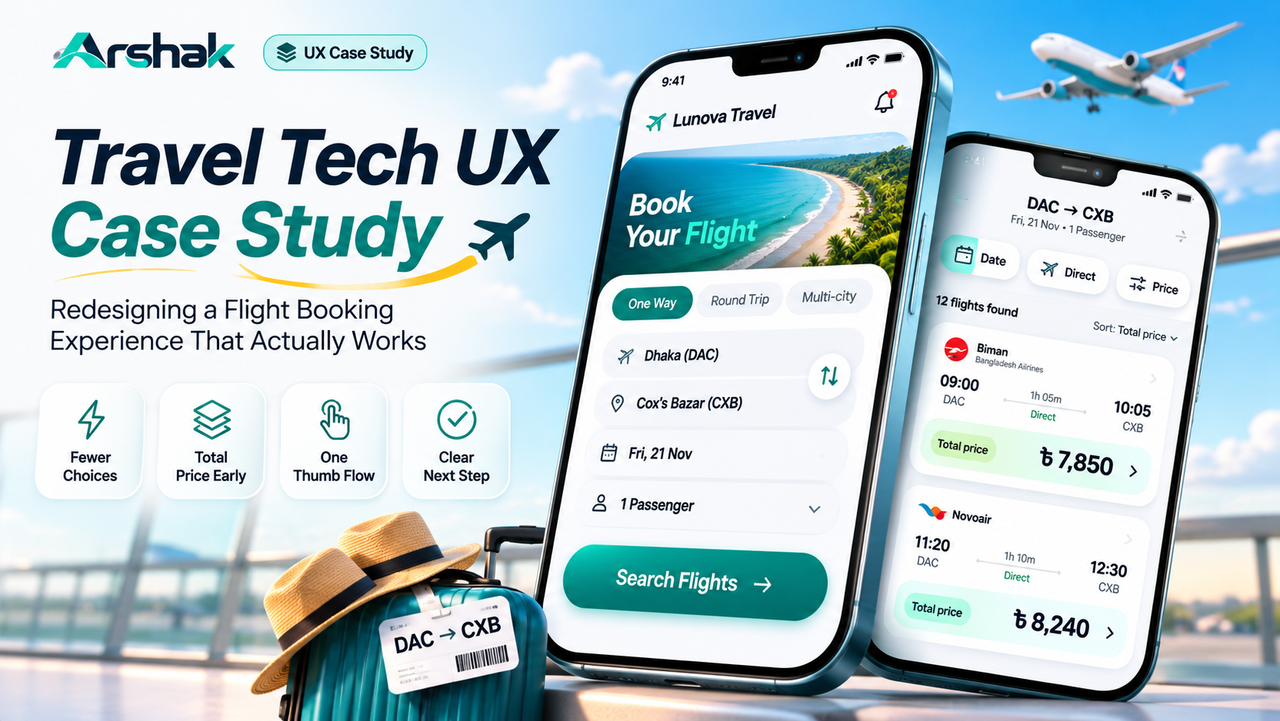
Booking a flight should take minutes, not patience. This travel tech UX case study shows how a flight search and booking flow was redesigned around one question: what does a traveller need to decide, and when?
A traveller in Dhaka wants a weekend flight to Cox's Bazar. She opens a travel app on her phone while standing in a queue. She has three minutes, one hand free, and a budget in mind. The app shows her 27 filters, fares without taxes, and a date picker that needs two hands. She closes the app and tries somewhere else. That moment, the abandon, is what this case study is about.
This is a concept case study, not a client project. It redesigns a flight search and booking flow using published research, the UX laws covered in this series, and a heuristic review of the old flow. Every problem below is stated as an observed friction, every decision as a design choice, and every outcome as something to measure next. Nothing here claims a result that was never tested.
In short: travel tech UX is the design of search, comparison, booking, and after booking care in travel products. The best flows show the total price early, ask for one decision at a time, and keep the traveller informed from search to confirmation.
The Brief and the Traveller
The brief was to redesign the flight search and booking flow of a travel app for domestic trips in Bangladesh. The traveller is a first time user booking Dhaka to Cox's Bazar for a weekend. She is price sensitive, booking on a phone, often on mobile data, and often while doing something else. Three working hypotheses guided the work, and they are hypotheses, not research findings: travellers compare total price, not base fare; travellers decide on a small screen with one hand; and travellers abandon when the next step is unclear.
The flow covers four stages: search, results, passenger details and payment, and confirmation. The redesign had to work inside those four stages, not add a fifth. Adding steps would have made the flow longer, and length is the enemy of a booking made in a queue.
Where the Old Flow Broke
The old flow failed in four places. First, the results page opened with 27 filters: airlines, times, stops, baggage, meals, seat types, and more, all visible at once. Choice overload is a known problem, and the Hick's law guide explains why more options slow decisions instead of helping them. Second, fares showed the base price, and taxes and fees appeared only at payment, so the cheapest looking flight was rarely the cheapest. Third, the date picker and the small "Select" buttons demanded precise taps, which is hard on a moving bus with one hand. The Fitts's law guide covers why target size and distance decide how fast a tap feels. Fourth, after payment the screen showed a booking reference and nothing else: no summary, no next step, no clear answer to "did it work?" Each problem is small on its own. Together they make booking feel like work, and that is a booking flow UX failure, not a feature gap.
What Travellers Actually Do
Published research sets the direction. Baymard Institute surveyed 3,125 US online shoppers in its 2026 flight booking study and found that 50 percent used airline websites to search for their last purchased flight, 29 percent used airline apps, and 38 percent used online travel agencies, with many checking more than one source. Travellers compare, and they compare across apps, so a flow that hides the real price loses to one that shows it. The same study found 78 percent of flight shoppers belong to at least one loyalty programme, and business travellers co-book hotels with flights far more often than leisure travellers, 56 percent against 35 percent. The lesson for design is plain: make prices comparable, make loyalty visible, and offer the next booking only after the flight is secure.
The Nielsen Norman Group's mobile usability research adds the other half. Its report is built on 19 in person and 2 remote moderated usability studies with users in 8 countries, and it treats mobile use as secondary, interrupted, and one handed. A booking flow must survive distraction, because the traveller is standing in a queue, not sitting at a desk.
Five Decisions That Shaped the Redesign
1. Three filters first. The results page now opens with three filters only: date, direct flights, and price range. Everything else sits behind one "More filters" control. The traveller sees a manageable choice and refines it when ready, instead of facing everything at once.
2. Total price on every card. Each result card shows the total price, including taxes and fees, in the largest type on the card, with the base fare underneath in smaller type. The sort order uses total price by default, so the first card is genuinely the cheapest. Nothing appears at payment that was not visible at search.
3. One thumb, one action. The primary action on each screen sits in the thumb zone at the bottom, at least 48 pixels tall, with a single clear label: "Select flight", "Continue to payment", "Confirm booking". Secondary actions are text links, not competing buttons. The traveller never has to choose between two buttons that look equally important.
4. Three steps, always visible. A progress indicator shows Search, Details, Pay, with the current step highlighted and completed steps marked. On confirmation, the screen answers three questions in order: the booking worked, what was booked, and what happens next, with the ticket and the receipt one tap away. The traveller never has to wonder whether the payment went through.
5. Errors that explain. When a fare sells out between search and payment, the screen says so plainly, shows the next closest fare, and keeps the traveller's details. When a card is declined, the message names the likely cause and offers one retry, not a generic failure. An error is a moment of trust: handled well, it keeps the traveller; handled badly, it ends the booking.
| Decision | Problem it solves | How to know it worked |
|---|---|---|
| Three filters first | Choice overload on the results page | More travellers reach a selected flight |
| Total price on every card | Hidden fees at payment | Fewer abandons at the payment step |
| One thumb, one action | Small targets and competing buttons | Faster, error free taps on mobile |
| Three steps, always visible | Uncertainty about progress and payment | More travellers finish confirmation calmly |
| Errors that explain | Dead ends after a fare sells out | More travellers recover and rebook |
States and Edge Cases
A booking flow is judged by its worst day, not its best. Five states were designed explicitly. No flights on the chosen date shows nearby dates with prices, not a dead end. A fare that sells out mid booking offers the next closest option and keeps the passenger details. A failed payment holds the booking for ten minutes and explains the next step. A slow connection shows a skeleton screen and a saved search, so the traveller can return without starting again. A price change between search and payment is flagged before payment, with the new total shown and the choice to continue or go back. Each state was sketched in Figma before the happy path was polished, because the happy path is the easy part.
Accessibility on the Move
Travel apps are used in sunlight, in noise, and one handed, so accessibility is not an extra. Text contrast meets WCAG AA, and the total price is never shown in colour alone. All controls work with a screen reader, with labels that say what the control does. The flow works at 200 percent text scaling without overlapping buttons, and the date picker accepts typed dates as well as taps. The full guidance is in the accessibility guide, and this flow was checked against it screen by screen.
Remember: a booking flow does not sell flights. It sells confidence. Every screen should answer one question: what do I do next, and what will it cost me?
FAQs
How is a UX case study different from a redesign?
A redesign changes the screens. A case study explains the thinking: the problem, the people, the evidence, the decisions, and what to measure next. The screens are the proof, not the story. A case study without reasoning is a portfolio gallery, and a gallery does not show how a designer thinks.
Can I run this process on my own project?
Yes. Pick one flow, map where people hesitate, name the principle behind each fix, and design the states and edge cases before polishing the happy path. Test with five real users and write down what they do, not only what they say. Then write the case study the same way: problem, people, evidence, decisions, measures.
Key Takeaways
- ✓ Travel tech UX covers search, comparison, booking, and after booking care, and the flow must survive interruption and one handed use.
- ✓ Travellers compare across sources, so show the total price early or lose the comparison.
- ✓ Three filters first, one primary action per screen, and a visible progress indicator keep the flow calm.
- ✓ Design the states and edge cases, sold out fares, failed payments, slow connections, before polishing the happy path.
- ✓ A case study proves its value with evidence and measures, not with claimed results. Label hypotheses as hypotheses.
Conclusion
The redesigned flow does not add features. It removes friction: fewer filters, honest prices, one action per screen, clear progress, and errors that help. The next step is testing with five real travellers on a phone, watching where they hesitate, and letting what they do change the design. That loop, question to evidence to fix, is the same one behind every article in this series, and it is the whole practice of travel app UX design. That is what good flight booking UX looks like in practice.
References and Further Reading
- Flight Booking and Airlines Quantitative UX Insights 2026, Baymard Institute
- User Experience for Mobile Applications and Websites, Nielsen Norman Group

Written by
Md Arshak Hossain Zahid
UI/UX Designer · Founder of ArshakUIX
Practical insights on UX laws, usability, design systems, and product design.