
Every product you admire looks like one product, not ten products stitched together. That consistency is not an accident. It is the work of design systems, and this guide shows how to build one that actually gets used.
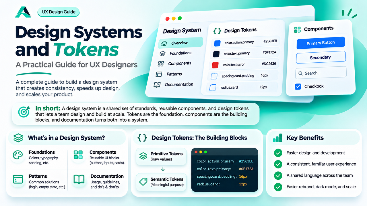
In short: A design system is a shared set of standards, reusable components, and design tokens that lets a team design and build at scale without reinventing the same button on every screen. Tokens are the foundation, components are the building blocks, and documentation is what turns both into a system.
What a Design System Really Is
Open any product you use every day and look closely. The buttons share the same shape and padding, the headings follow the same scale, and the error messages look related even on different screens. That is not a coincidence. It is the result of a system.
The Nielsen Norman Group defines a design system as a complete set of standards intended to manage design at scale using reusable components and patterns. Three words do most of the work: complete means it covers more than visuals, standards means it contains decisions rather than assets, and at scale means it exists for the moment a product grows beyond what one person can hold in their head.
A design system is not a Figma file full of buttons. A file of buttons is a UI kit, useful but only one piece. A real system has four parts. Foundations: the colour palette, type scale, spacing scale, and the rules for using them. A component library: the reusable buttons, inputs, cards, and dialogs. A pattern library: standard solutions to recurring problems, such as a login flow or an empty state. And documentation: when to use each component and what not to do. There is also a fifth part no diagram shows: the people who maintain it. The Nielsen Norman Group recommends a minimum team of one interaction designer, one visual designer, and one developer. A solo designer can run a small system alone, but somebody has to own it, or it goes out of date.
Why Design Systems Matter
The primary benefit is speed at scale. Once a button exists, tested and coded, the next screen that needs a button takes minutes instead of an hour. That saving looks small on one screen and becomes enormous across a product with hundreds of screens. The second benefit is consistency, and consistency is a user experience issue, not a cosmetic one. When every primary action looks the same, users learn it once and recognise it everywhere.
The third benefit is a shared language. When the whole team calls the same element a primary button, a toast, or a modal, conversations get shorter and misunderstandings get rarer. The fourth benefit only appears over time: a system makes big changes cheap. A rebrand, a dark mode, or a new platform becomes a change to a set of tokens and components, rather than a redesign of every screen.
However, a system is not always the right answer. For a one-off prototype, or a small team with one product and a handful of screens, a simple style guide and a few shared components are enough. The honest question is whether your product has enough repeated work ahead of it to repay the cost. If yes, start. If no, keep it light and revisit the question in six months.
Design Tokens: The Smallest Decisions, Made Once
If a design system is a building, tokens are the bricks. A design token is a named value for a single design decision, such as a colour, a font size, or a spacing value. Instead of writing the hex value #2563EB in fifty places, a team defines a token once and refers to it by name everywhere. When the value changes, it changes in one place, and every screen updates.
Tokens come in two levels, and the difference decides whether a system survives a rebrand. Primitive tokens hold raw values, such as color.blue.500: #2563EB. Semantic tokens sit on top of them and carry meaning, such as color.action.primary: color.blue.500 or color.text.error: color.red.600. A semantic token says what the value is for, not what it is.
That layer of meaning is what makes a system flexible. With semantic tokens, a dark mode is a mapping: color.background.primary points at white in light mode and at a dark surface in dark mode, and every component follows. The same logic applies to a rebrand: one primitive token changes, and every semantic token that points at it follows.
Naming is where most token systems succeed or fail. Name tokens for their purpose, never for their value: color.action.primary survives a rebrand, blue-500 does not. Keep names predictable, category first, then property, then variant, then state, as in color.background.card.hover. These design system naming conventions keep a system usable as it grows.
Tokens are also where accessibility lives in a system. Text colour tokens can be chosen so that every pairing passes the contrast ratio, and the rule is enforced once, in the token. For the ratios and the checks, read the guide to accessibility in UX design.
| Token | Value | Used for |
|---|---|---|
| color.action.primary | #2563EB | Primary buttons, links, and key actions |
| color.text.primary | #0F172A | Headings and body text on light surfaces |
| color.text.error | #DC2626 | Error messages, invalid fields, and destructive actions |
| spacing.card.padding | 16px | Inner padding of cards and panels |
| radius.card | 12px | Corner radius of cards and dialogs |
How to Start a Design System in Figma
Starting a system feels large, so start small and start with the mess you already have.
1. Audit. Collect the screens of your product and list every distinct button style, text size, colour, and spacing value. The list will be longer than you expect. Circle the duplicates that do the same job: those become your first shared components.
2. Define tokens. Define the primitive values first: a small colour palette, a type scale, and a spacing scale on a base unit. Then define the semantic tokens that point at them, and put them in Figma as variables in two collections. Keep the list short: ten tokens everyone uses beat fifty nobody can remember.
3. Build the core components. Build the core components your audit showed up everywhere: button, input, card, dialog, and toast. Build each one with its states and variants, using your tokens instead of hard-coded values, and test each one in a real screen.
4. Write one page of documentation. For each component, write what it is for, when to use it, and one do and one do not example. A short page people actually read is worth more than a wiki nobody opens.
5. Set up governance. Decide who owns the system, how changes get proposed, and how often it gets reviewed: a monthly review of half an hour is enough for a small system. Without that habit, the system drifts and teams lose trust in it.
Common Mistakes
Building components before tokens. When components hard-code their own colours and spacing, a brand change means editing every component by hand. Define tokens first.
Naming tokens after their values. A token called blue-500 breaks the day the brand colour changes. Name tokens for their purpose, and let the value change freely underneath.
Copying a public system wholesale. Google Material Design, IBM Carbon, and the Atlassian system are excellent references, designed for their own companies. Borrow their structure, then adapt the values, components, and patterns to your own brand and users.
Shipping components without guidance. A component library with no documentation is a box of parts with no instructions. Every designer will assemble them differently.
Treating the system as a side project. A system with no owner and no review habit goes stale within months. Give it an owner, a changelog, and a monthly review.
Remember: a design system is not a Figma file. It is a set of decisions, made once and reused everywhere, with an owner who keeps them honest. If nobody maintains it, it is not a system, it is a snapshot of how things used to look.
FAQs
What is the difference between a design system and a style guide?
A style guide is one part of a design system: it covers the visual language, colours, typography, and logo use. A design system adds components, patterns, documentation, and the people who maintain them. Think of the style guide as the dictionary and the system as the whole language.
When is a design system worth building?
When the product has enough repeated work ahead of it to repay the cost. A product with dozens of screens, more than one platform, or more than one team will repay it quickly. A one-off prototype will not. Judge by the work ahead, not by the fashion of the moment.
How do tokens relate to Figma variables?
Figma variables are the tool that stores tokens in Figma: primitives in one collection, semantic tokens in a second that references the first, and modes for light and dark themes. The same structure maps to code as CSS custom properties.
Key Takeaways
- ✓ A design system is a shared standard for managing design at scale: foundations, components, patterns, and documentation.
- ✓ Tokens are named values for colour, type, spacing, and radius. Change a token once and every screen using it updates.
- ✓ Semantic tokens carry meaning, such as color.text.error, and primitive tokens carry raw values, such as #DC2626.
- ✓ A style guide is only one part of a design system, and a UI kit is a set of components without the rules that make it a system.
- ✓ Start small: audit the mess, define tokens, build the most used components, document them, and assign an owner.
- ✓ A system without an owner and a regular review goes stale, and teams stop trusting it.
Conclusion
A design system does not make a product good on its own. It makes good decisions cheap to repeat and bad decisions easy to fix. That is the whole value, and it is enough. When the colour, the spacing, and the button are decided once, the team spends its time on the problems that actually need thinking: the flow, the content, and the user.
Start with the mess you already have. Audit it, tokenise the colours and the spacing, build the ten components every screen uses, and write one page that says how to use them. Then give the system an owner and a monthly review. In six months, the product will look like one product, and the next screen will take half the time the last one did. That is what a design system is for.
References and Further Reading
- Design Systems 101, Nielsen Norman Group
- What are Design Systems?, Interaction Design Foundation
- Carbon Design System, IBM
Written by
Md Arshak Hossain Zahid
UI/UX Designer · Founder of ArshakUIX
Practical insights on UX laws, usability, design systems, and product design.