
Good navigation feels invisible. When users find what they need without thinking, that is not luck. It is information architecture, and this guide shows how to build it.
Information architecture is the work of organising content so people can find what they need and understand where they are. It decides how a travel app groups flights, hotels, and support, how a bank labels its accounts, and how a documentation site turns thousands of pages into a path a reader can follow. When it works, nobody notices it. When it fails, users blame themselves and leave.
In short: IA is the practice of organising, labelling, and structuring content so people can find it and understand it. A sitemap is one drawing of that structure, not the structure itself. The best test of any IA: can a first-time user find what they came for?
What Information Architecture Really Is
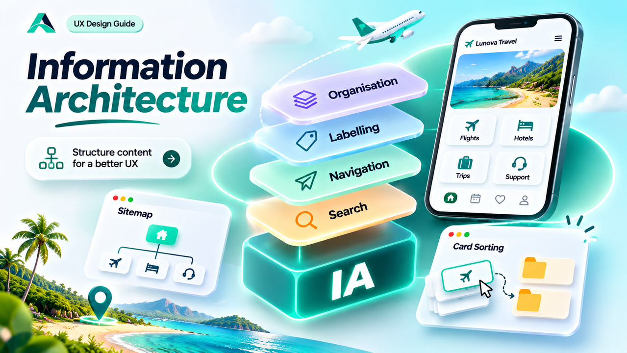
The term comes from the book Information Architecture: For the Web and Beyond by Louis Rosenfeld, Peter Morville, and Jorge Arango, the book that defined the field. They describe it as the combination of four systems: organisation, labelling, navigation, and search.
The Interaction Design Foundation puts it more simply: it is the discipline of making information findable and understandable. Findable means a user can locate the thing they came for. Understandable means that once they arrive, they know what it is and where they are.
It helps to say what IA is not. It is not a sitemap. The Nielsen Norman Group is clear on this: a sitemap is a visual representation of the organisation of a site's content, and only one part of the IA. The sitemap is a drawing of the result, not the result itself.
The Four Systems That Make Content Findable
Every product's IA is built from the same four systems, and a weakness in any one of them shows up as users getting lost.
Organisation systems decide how content is grouped. Exact schemes, such as alphabetical order or dates, work when users already know what they want. Ambiguous schemes, such as grouping by topic, task, or audience, work when users are exploring. Most products need both, and the scheme should follow the user's task.
Labelling systems decide what things are called. A label is a promise: it tells the user what they will find if they tap. Good labels use the user's own words. Bad labels use internal jargon or words so vague they could mean anything. "Solutions" and "Resources" tell the reader nothing. Test a label by asking five strangers what they expect to find behind it.
Navigation systems decide how people move. Global navigation shows the main sections on every page. Local navigation shows the options inside one section. Contextual navigation offers links related to what the user is doing now. Breadcrumbs show where the user is and offer a way back up.
Search systems decide how people find things when browsing is not enough. On a site with hundreds of pages, nobody browses the whole structure, so search needs the same care as navigation: good metadata, tolerant handling of synonyms and typos, and results with enough context to judge. Search is the safety net that catches the cases browsing cannot reach.
| System | What it decides | Example in a travel app |
|---|---|---|
| Organisation | How content is grouped | Trips by destination and booking status |
| Labelling | What things are called | "My trips" instead of "Booking management" |
| Navigation | How people move between things | Global menu, breadcrumbs, related trip links |
| Search | How people find things directly | Search by city, date, or reference |
How Users Actually Find Things
Users do not study a menu the way a designer studies a wireframe. They scan it, looking for a word that matches the picture in their head of what they need. That picture is their mental model, built from every similar product they have used before. When the menu matches the model, finding feels effortless. When it does not, users hesitate, guess, and quietly blame themselves.
This is why IA work starts with research, not with drawing boxes. A journey map shows the information needs before you decide where anything goes. For the method, read the guide to user journey mapping. Users also follow the scent of information: the feeling that a label leads toward what they want. A weak scent makes them stop, and every wrong turn costs trust.
Card Sorting: Let Users Show You the Structure
Card sorting is the most direct way to learn how users group your content. The Nielsen Norman Group defines it as a research method in which participants place labelled cards into groups that make the most sense to them. Each card represents a page, a feature, or a piece of content, and the result is a picture of the user's mental model, drawn by the user. In card sorting UX work, the sort itself is the research: you watch how people think, not how they follow your structure.
There are three types. In an open card sort, participants create their own groups with no predefined categories. This is the most common type, and the one to start with. In a closed card sort, participants sort cards into categories you define, which validates a structure you already have. In a hybrid sort, you provide some categories and let participants create the rest, but the Nielsen Norman Group generally recommends against this, because the predefined categories bias the results.
To run one, create 30 to 50 cards and write each label in plain language. Avoid repeating the same word across cards, because participants will group by the repeated word instead of thinking about the deeper relationship. Ask participants to organise the cards into groups, with no preset number, and to leave aside any card they do not understand. Then ask them to label each group. Finally, analyse the results: the groupings most participants agreed on, and the cards that kept landing in different places.
Recruit at least 15 participants for a qualitative sort and 30 to 50 for a quantitative one, and run it remotely with OptimalSort. Card sorting has limits: it shows how users group content, not what the final labels should be. Treat it as the starting point, and validate the result with tree testing before you build the navigation.
From Card Sort to Sitemap
Once the card sort shows you the groupings, turn them into a hierarchy. Make the groups users agreed on most strongly your top-level sections, and keep the structure shallow: more items at each level, fewer levels, with the important content within three taps of home. Resist a category for every edge case. In sitemap UX design, the sitemap is a communication tool: it lets the team see the structure in one view and argue about it before anything is built.
Then test the structure before you ship it. Tree testing shows users a text-only version of your hierarchy and asks them to find specific items. If users look for "Reset PIN" under "Cards" when you placed it under "Security", the tree test will show it, and you can fix the grouping before a single screen is designed. The IA is not finished when the sitemap is drawn. It is finished when users can find things in it.
Navigation Patterns That Work
For a small product, a global menu with five to seven top-level items is enough. For a large catalogue, faceted filters beat a deep menu. Breadcrumbs earn their place on any site deeper than two levels, and on mobile a bottom bar keeps the main destinations within thumb reach. A website navigation structure that passes the first-time user test is doing its job.
Common Mistakes
Copying the org chart. When the menu mirrors the company's departments, users must learn the company first. Group by user tasks instead.
Writing labels in internal jargon. "Solutions", "Resources", and "Manage" tell nobody what is inside. Use your users' words, and test labels with five strangers.
Building a menu with twelve top-level items. Every department wanted a link, and the menu became a directory. Keep the top level short and let search carry the rest.
Treating the sitemap as the whole IA. A sitemap shows the hierarchy. It does not test the labels, the groupings, or whether users can find anything. An untested sitemap is a guess.
Hiding search on a content-heavy site. When a site has hundreds of pages, search is a main entrance, not a fallback. Give it good metadata and results with context to judge.
Designing the IA once and never revisiting it. Content grows and products change. Review the structure regularly and prune what no longer earns its place.
Remember: structure follows the user's mental model, not your org chart. If users cannot find it, it does not exist. Test the structure with real people before you build the navigation.
FAQs
What is the difference between IA and UX design?
IA is one part of UX design. UX covers the whole experience: research, flows, interaction, visual design, and testing. IA covers the structure inside that experience: how content is organised, labelled, and made findable.
How many items should a main menu have?
There is no magic number. As a practical guideline, aim for five to seven top-level items: short enough to scan at a glance, long enough to cover the main sections. If you need more, the grouping is usually the problem, not the number.
Key Takeaways
- ✓ IA is the practice of organising, labelling, and structuring content so people can find it and understand it.
- ✓ IA has four systems: organisation, labelling, navigation, and search. A sitemap is only one drawing of the structure.
- ✓ Good IA follows the user's mental model. Card sorting reveals that model before you commit to a menu.
- ✓ Shallow, clearly labelled groups beat deep menus. Labels must use the user's words, never internal jargon.
- ✓ IA is never finished: test it with tree testing, watch where users get lost, and prune it as content grows.
Conclusion
IA is invisible work, and that is exactly why it matters. Nobody praises a menu or shares a screenshot of a good sitemap. What people do is stay, find what they came for, and come back.
Start with the users, not the boxes. Run a card sort, build the sitemap from the groupings they agree on, and test it before you design a single screen. Findability is not a feature you add at the end. It is the foundation everything else stands on.
References and Further Reading
- Information Architecture vs. Sitemaps, Nielsen Norman Group
- Card Sorting: Uncover Users' Mental Models, Nielsen Norman Group
- Information Architecture (IA), Interaction Design Foundation
- Louis Rosenfeld, Peter Morville, and Jorge Arango, Information Architecture: For the Web and Beyond (4th ed., 2015)

Written by
Md Arshak Hossain Zahid
UI/UX Designer · Founder of ArshakUIX
Practical insights on UX laws, usability, design systems, and product design.