
A button that does nothing when you tap it is not a design choice. It is a broken conversation, and interaction design is the craft of making that conversation feel effortless.
Interaction design basics sound simple until you watch someone use a product for the first time. They tap a button and wait. Nothing happens, so they tap again. Then a spinner appears, then an error, and they leave convinced the product is broken. None of this is about how the screen looks. It is about what happens when a person acts.
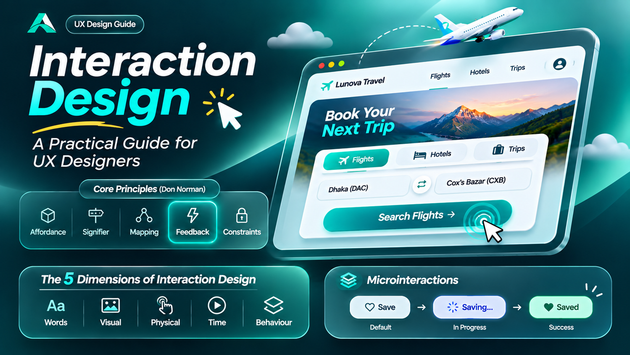
This guide covers the five dimensions, Don Norman's principles, microinteractions, and the states and motion that keep users oriented.
In short: interaction design (IxD) is the design of the dialogue between a person and a product: what happens when someone taps, types, swipes, or waits. The test of any interaction is simple: can a first-time user act and understand the result?
What Interaction Design Really Is
The term was coined by Bill Moggridge, co-founder of IDEO, in the 1980s, when products began to ask people to do more than look at them. The Interaction Design Foundation defines it as the design of interactive products and services, with the focus on the way users will interact with them.
John Kolko, author of Thoughts on Interaction Design, describes it as the creation of a dialogue between a person and a product, system, or service. A dialogue has turns: the user acts, the product responds, the user adjusts, and the product answers again. When any turn goes missing, the conversation breaks down.
UX design covers the entire journey: research, branding, flows, function, and testing. UI design covers the visual components. Interaction design targets the moment of use, which the Interaction Design Foundation calls the acid test of a design. A beautiful screen with a broken interaction fails regardless of the brand behind it.
Interaction Design Basics: The Five Dimensions
Gillian Crampton Smith of London's Royal College of Art and Kevin Silver, a senior interaction designer, first defined the five dimensions.
| Dimension | What it covers | Example in a travel app |
|---|---|---|
| Words (1D) | Labels and messages that inform the user | "Search flights" says exactly what happens next |
| Visual representations (2D) | Icons, images, typography, and colour | A calendar icon marks the date field |
| Physical objects and space (3D) | The device and how it is held and touched | Key actions sit within thumb reach on a phone |
| Time (4D) | Animation, sound, and anything that changes over time | A spinner shows results are loading |
| Behaviour (5D) | How the other four define what users can do | The button disables itself after one tap |
Change one dimension and the others shift. Run any interaction through the five dimensions before you ship it.
The Core Interaction Design Principles
These interaction design principles come from Don Norman's The Design of Everyday Things, and affordances and signifiers come first, because together they decide whether a user can even find the action.
An affordance is the relationship between a person and an object that defines what actions are possible: a chair affords sitting, a handle affords pulling, a button affords pushing. James Gibson coined the term in 1977, and Norman brought it into design in 1988. On a screen, affordances are often invisible, which is why they need their partner, the signifier. A signifier is a perceivable cue that communicates where an action should take place. Norman draws the line plainly: affordances determine what actions are possible, and signifiers communicate where the action should take place. A raised button with a clear label is a signifier; a flat grey rectangle that looks like body text is not. A false affordance, such as underlined text that is not a link, is worse than a missing one, because it teaches users to distrust the interface.
Mapping is the relationship between controls and their results. Stove knobs arranged like the burners are good mapping: turn the knob on the left, the burner on the left heats up. A volume slider that moves up means louder, and a toggle that slides right means on. Good mapping borrows the user's existing expectations instead of asking them to learn a new one.
Feedback tells the user that an action happened and what state the product is in now. It must be immediate and tied to the specific action. Don Norman warns that even a delay of a tenth of a second can be disconcerting. Good feedback is proportional: a press animation for a small action, a progress indicator for a slow one, and a clear confirmation for anything irreversible. The Fitts's law guide covers the other half: targets big enough and close enough to tap confidently.
Constraints limit what a user can do, and that is a kindness when the limit prevents an error. A greyed out "Create account" button that stays disabled until the form is complete stops a submission that would fail. Constraints work best when they are visible and explained.
Microinteractions: The Small Moments That Matter
Most of what a person does with a product is made of tiny, single-purpose moments: liking a post, saving a hotel, setting an alarm. Dan Saffer named these microinteractions in his book Microinteractions: Designing with Details, and he breaks each one into four parts: a trigger, rules, feedback, and loops and modes.
The trigger starts it: a tap on a heart icon, or a system event such as a download finishing. The rules decide what happens next. The feedback is what the user sees, hears, or feels: the heart fills and pops, the toggle slides and changes colour, the password field shows a strength meter as you type. The loops and modes decide how it behaves over time.
In microinteractions UX, the details are the product. A like button that fills instantly feels alive; one that waits for the server feels broken. Pull to refresh works because the rules are visible: pull down, see the spinner, release, watch the list update. Keep them fast and quiet: a microinteraction should never delay the task it belongs to.
States, Transitions, and Motion
Every interactive element has states, and each state is a sentence in the conversation. A button has default, hover, pressed, focus, disabled, loading, error, and success states. A text field has empty, filled, focused, and error states. A screen has loading, empty, loaded, and error states. Design each one before you ship: a form with no error state breaks on its first error, and a button with no loading state invites the double tap that charges a user twice.
Motion is the grammar that connects these states. When a card expands from the place you tapped, motion explains where it came from. When a list item slides away after you delete it, motion confirms what happened. Keep simple transitions around 200 to 300 milliseconds: long enough to be seen, short enough to feel instant. Motion that lasts longer than the task it explains is decoration, and decoration that slows people down is a defect.
Motion is also feedback. A skeleton screen says the content is on its way, and it is kinder than a spinner because it shows the shape of what is coming. But motion must respect the people who do not want it: honour the system's reduced motion setting and keep essential information visible when animation is off. Focus states deserve the same care. For the details, read the guide to accessibility in UX design.
Common Mistakes
Buttons with no pressed state. If a button looks identical before and after a tap, the user cannot tell whether the tap registered.
Silent actions. A tap that changes nothing visible feels like a failure. Every action deserves an answer.
Animations that delay the task. A one second flourish on every screen change adds up to minutes of waiting. Animation should explain the change, then get out of the way.
Hidden gestures with no signifier. A swipe or long press that nothing hints at is a feature only its designer knows about. Show a cue: a partial reveal, a hint on first use, or a visible button that does the same thing.
Error messages that blame the user. "Invalid input" tells the user they failed and offers nothing. A good error says what went wrong and what to do next.
Copying a pattern without its behaviour. A toggle that looks like a switch but does not animate or confirm its state is a picture of a control, not a control. Copy the behaviour too.
Remember: good interaction design is a conversation. The user acts, the product answers immediately, and the answer is clear enough that nobody needs a manual.
FAQs
What is the difference between interaction design and UI design?
UI design decides how the interface looks: layout, colour, typography, and the appearance of buttons and cards. Interaction design decides how it behaves: what happens when someone taps, swipes, types, or waits. The two overlap, but a beautiful UI with broken interactions still fails.
Do I need to learn motion design to do interaction design?
No, but you need to understand what motion is for: it explains cause and effect, where a screen came from, what changed, and whether an action worked. Start with states and feedback, then learn easing and timing as you go. Figma's Smart Animate lets you prototype most of it without code.
Key Takeaways
- ✓ Interaction design is the dialogue between a person and a product: what happens when someone acts and how the product answers.
- ✓ The five dimensions, words, visuals, space, time, and behaviour, are the material every interaction is made from.
- ✓ Affordances and signifiers work as a pair: affordances say what is possible, signifiers show where, mapping connects control to result, feedback confirms it.
- ✓ Microinteractions are small, single-purpose moments with a trigger, rules, feedback, and a loop. Done well, they carry the product's personality.
- ✓ Design every state before you ship: default, hover, pressed, disabled, loading, empty, error, success. A missing state is a broken conversation.
Conclusion
A product is not its screens. It is the moments between them: the tap, the wait, the answer, and the recovery when something goes wrong.
These interaction design basics are the foundation: five dimensions, four principles, and one habit of designing every state. Start with one flow you care about, prototype the conversation, and test it with five real users. The guide to usability testing shows how to run that test in an afternoon. Make the conversation clear, immediate, and forgiving.
References and Further Reading
- What is Interaction Design (IxD)?, Interaction Design Foundation
- What are Affordances?, Interaction Design Foundation
- Don Norman, The Design of Everyday Things (Revised and Expanded Edition, 2013)
- Dan Saffer, Microinteractions: Designing with Details (2013)

Written by
Md Arshak Hossain Zahid
UI/UX Designer · Founder of ArshakUIX
Practical insights on UX laws, usability, design systems, and product design.